Wednesday, September 10, 2025

ELEVEN REBELS ON THE ROOF


In 1961, two noteworthy events occurred in the art world: 

           1.  The artist Piero Manzoni sold cans of his own shit as 
                conceptual art.


          2. Eleven young realist painters took to the rooftops of 
            New York in rebellion against the modern art of their day.


Today Manzoni's canned shit enjoys a place of honor in the prestigious Tate Art Museum in London.  I've been unable to locate work by the eleven realists at the Tate, but today I'm displaying some of their work here on the equally prestigious IllustrationArt blog.


For a century modern artists prided themselves on being rebels against the establishment.  There was post-impressionism, cubism, fauvism, futurism, surrealism, modernism, dadaism, orphism, expressionism, abstract expressionism, conceptual art, and pop art schools (quickly followed by op art, postmodernism, neo-expressionism, minimalism, color-field, graffiiti, installation, performance, earthworks and assorted other schools). Each one enjoyed their time in the headlines.


In an exhibition of paintings called “A Realist View” at the National Arts Club, the eleven questioned whether the new so-called freedom of modern art was an improvement.  They wrote, “This freedom from obligation has resulted, very largely, in an impoverishment of the artist’s imagination, not an enrichment of it.”  


The eleven artists were committed to realism but wanted to show that reality, when perceived through different eyes, could be very diverse and fertile. 


Artist Burt Silverman worked with a psychologically insightful approach. Rather than try to spell out concepts directly with symbols and narratives, Silverman seemed to know, in the words of Auden, that 

We have to regard the universe etsi deus non daretur: God must be a hidden deity, veiled by His creation.


Contrast Silverman's brand of realism with Harvey Dinnerstein's allegorical mural of the parade of his times:


It was painted in a sharply realistic yet fantastical style, very different from the work of the others.


Daniel Schwartz, another realist, explored bold colors and patterns in his work:


"Epiphany" by Schwartz


David Levine worked differently, with a powerful graphic style


Aaron Shikler softened realism for his elegiac tribute to President Kennedy which is hanging in the White House  (unless of course the current occupant has taken it down):


The work of the eleven revealed very different faces of realism, demonstrating how it still offered plenty of meaningful opportunity for innovation, variety and growth.

The excitement of the new is difficult to resist.  Art that surprises us with unexpected valuations of things can always be titillating for a while.  "The cult of the new" has seduced many artists to race for the new and different, as if novelty itself is a virtue.  But the point here is that there can be more vitality in realisms than in many of the most far flung experiments of postmodernism. 


Tuesday, September 02, 2025

KENT WILLIAMS RELINQUISHES CONTROL


You put your left foot in, you take your left foot out,
You put your left foot in, and you shake it all about.

                                                        --- The Hokey Pokey 

Many contemporary artists seem to have have concluded that accuracy and realism are no longer sufficient, so they start a picture in a careful, realistic style then rough it up with an element of wildness-- a spill, a splatter, a deconstruction, a crude gesture.

Here, for example, the talented Jack Unruh proves that he can master fine detailed pen work but then offsets it with a loosely applied thick, wet black brush:


Next, the talented Joe Ciardiello draws with a sensitive, delicate line, but comes back with spatters of fluorescent paint and a primitive black brush that runs dry halfway through its mission:


Each in their own distinctive way, artists seem to feel that a picture benefits from the open clash of two opposite extremes.  They first demonstrate their great control of technical skills (as if to prove their credentials) then balance it with with pagan elements (as if to avoid the shame of appearing too civilized).  When done well, this increases the range of the drawing.

Andrew Wyeth, after slaving away on a very precise, careful painting, looked at it in despair and decided the only way he could cure it was to risk everything by throwing a cup of paint right in the middle of the picture. Then he quickly left the room before he lost his nerve and attempted to re-assert control. 

One of my favorite artists who pairs control with lack of control is Kent Williams:

Note how the fine line, detailed realism of this bird is enhanced by a messy ochre stain:


It contributes freedom and a casual looseness to what otherwise might be a too tight drawing.  It improves the composition and design, expands the range and contributes a more organic, natural feel to the work. 

Here is another example of an accomplished drawing where Williams gambled with an out-of-control spill and ended up improving it beyond what tight drawing might have accomplished:


After paying the terrible dues necessary to learn how to draw with control, how much of that control are we willing to surrender?  That is the question:


Monday, August 25, 2025

THE VIEW FROM SAVONAROLA'S WINDOW


Savonorola by Fra Bartolomeo (1498

Be sure to keep your eyes open if you visit the convent of San Marco in Florence where the fearsome Dominican friar, Girolamo Savonarola (1452-1498) launched his fiery tirades against modern art.

Savonarola, one of the earliest art critics, lived in a small cell which has been preserved complete with his famous chair. 


Savonarola preached contempt for the world (contemptu mundi) which was a sordid place of adultery, sodomy, murder, and envy.  One of its worst culprits was modern art which focused on humanistic subjects, luring people away from proper religious subjects.  Such art was a "vanity" which deserved to be burned in bonfires in the Florence public square, along with books, mirrors and other sinful, unauthorized objects.   

Savonorola proclaimed that "crude scenes that make people laugh shall not be painted" (which would essentially put this blog out of business).  He said that art should be viewed through "spectacles of death" to keep us focused on our mortality, and he railed against art with "indecent figures." No one, he wrote, should be permitted to paint "unless they... paint honest things." 

The convent knew that the world had its distractions, such as blue skies, green grass and singing birds.  To help protect the friars from temptation, the convent windows were boarded up, leaving only a small opening.


The beauty of nature could only be countenanced in limited doses.


As I stood in Savonorola's cell, thinking of the man whose eloquence caused the burning of Botticelli's paintings, I noted a tiny imperfection on the bars of his window.  I walked over, took a closer look, and was startled to discover a small devil's head looking back at me.  


I checked with an official at the convent and yes, Savonarola had instructed that a devil's head be affixed to his bars in case he was ever tempted to linger too long looking out at nature.  

Wednesday, August 20, 2025

THE MISCEGENATION OF WORDS AND PICTURES

Words are different from pictures, which might explain why they have different names.  

Even though words and pictures may never fully combine, their mere frottage (in both senses of the word) can bring a new richness and multi-dimensionality to art. 


Verbal creation and visual creation each contribute different strengths and perspectives to their partnership.  As Swinburne said,
Light is heard as music, music seen as light.   
Through the centuries, illustration is the art form where words and pictures have interacted most closely.  Traditionally, this meant words next to the picture, but still separate:


Comics integrated the words directly into the picture, sometimes with mixed results:


Word balloon competes with drawing (Neal Adams)


MAD Magazine parody

But over the years, artists have found interesting and engaging ways to combine visual thinking with verbal thinking.  No one was better at it than the great Saul Steinberg


Commercial artists who used words as graphic symbols became an inspiration for pop art.


Bob Peak employs words as design elements

I do like the way Claes Oldenberg used words as graphic objects, obliterating the meaning of the words:


I've previously outraged readers by publicly admiring Cy Twombly's Orpheus, which-- unlike Oldenberg-- incorporates the meaning of the word, painting it in a way that evokes its rich content:

Orpheus by Cy Twombly

Yessir, people have wrestled with cross breeding words and pictures in all sorts of ways:


But in my view, the marriage of words and pictures remains largely unconsummated in post modern conceptual art.  

Famed artist Jenny Holzer places text side by side with images-- perhaps on a colored background or carved into a bench-- without ever combining or even juxtaposing their different characteristics.  These words would fail as literature so Holzer seeks to find legitimacy by taking up residence in the less discriminating side of town: the visual arts.


Holzer apparently believes that projecting boring platitudes on the side of a building transforms them into Art.

Similarly, many other contemporary artists who are incapable of doing the heavy lifting of combining words and pictures rely exclusively upon words (yet still hope to claim credit as visual artists):


Museum of Modern Art displays pages from the Montevideo phone book with the names of political victims.  

Apologists and pedants have attempted to justify this use of words as a substitute for pictures, claiming in learned treatises that words were simply a cool new form of visual art.  

It may be that in the marriage of words and pictures, some people believe images are the weaker spouse and can be supplanted.  Not me.  Pictures preceded the written word and will be there at the end to receive it.


Thursday, August 07, 2025

ERIC DROOKER's MOLOCH

 I love this powerful cover to The New Yorker by Eric Drooker.

The ancient demon god Moloch sits astride the city
for the New Yorker's annual "Money" issu
e. 

In ancient legend, people hurled their own children into the flames as sacrifices to Moloch.  By the time of the Hebrew bible, the book of Leviticus prohibited making such sacrifices, but the dark god continued to find true believers and lives on in allegory.  He can be found in the works of William Blake, John Milton's Paradise Lost, and Fritz Lang's Metropolis.  More recently, Moloch played a prominent role in Allen Ginsberg's famous poem, Howl.  ("What sphinx of cement and aluminum bashed open their skulls and ate up their brains and imagination?")

When Drooker first conceived of this image, he captured it quickly with a ballpoint pen:


In the next version he shed that full moon, choosing instead to illuminate the city from below, under a dark sky-- a masterful touch in my opinion.  He then worked out the perspectives in pencil:


He drew the final version in ink, before adding color:


The New Yorker employs many excellent writers who've contributed strong articles about economics and plutocracy, about venal politicians and rapacious investment bankers.  But no linear assemblage of nouns, verbs and adjectives, policed by punctuation, can possibly deliver a message the way Drooker's cover does.  

Here we see the value of good illustration: an immediate visual impact that grabs you by the lapels, combined with a haunting presence that lingers long after paragraphs of statistics and adverbs have faded. In an instant, the belching smokestacks and steaming nuclear reactor towers are tied to the fiery furnaces of Nebuchadnezzar II, and modern profiteers and collaborators are shown to serve the same dark gods as our primordial ancestors.  No written article could get away with such a message.  

Drooker never dreamed that the New Yorker would accept such an image for its cover.  He didn't draw it for The New Yorker and only submitted it at the urging of a friend.  But I'd like to see the New Yorker run more covers like this, covers that recognize today's peril.  Some of the essays inside, including those by editor David Remnick, employ stern language suitable to the high stakes for liberal democracy,  Yet most of the cover illustrations continue to offer light hearted moments and political jokes.  I would love to see more cover art that corresponds to the seriousness of the time. 

Monday, August 04, 2025

CAN'T DRAW HORSES

Fortunately, Maurice Sendak couldn't draw horses.  

His contract required him to illustrate a children's book called Where the Wild Horses Are, but no matter how hard he tried, he just couldn't draw horses well.  Sendak struggled and struggled, then in one creative leap he substituted wild things for wild horses, and the story took off from there.


Where the Wild Things Are became a landmark in the history of children's literature, a seminal work that inspired an opera and a feature film and sold over 20 million copies around the world.  It made Sendak's legacy.

The artist Jackson Pollock couldn't draw horses either.

Pollock wanted to be a representational painter.  He struggled to paint horses but could never get them quite right.


In 1947 Pollock told a friend, artist Harry Jackson, that he'd tried to paint a mural of stampeding horses to satisfy an important commission but lacked the discipline or skill. 

Finally “he got mad,” Harry recalled Pollock saying, “and started to sling the paint onto the canvas to create the driving, swirling action and thrust the composition and the heroic size demanded.”  Pollock's frustration over his inability to paint horses fueled a creative leap to one of the first important abstract expressionist paintings.  He abandoned horses altogether and pioneered a new kind of art with all of the energy but none of the representational constraints.

Pollock's mural gave the art world a jolt.  The art critic Clement Greenberg wrote: "I took one look at it and I thought, 'Now that's great art,' and I knew Jackson was the greatest painter this country had produced."

Susan Rothenberg couldn't draw horses either, but by that time nobody gave a damn.  

Rothenberg painted in an era when artists no longer needed to feel shame.  She painted horses like this and she painted them real big, with oversized confidence:


The art critic for The New Yorker crowed about the "asteroidal impact" of Ms. Rothenberg's horse pictures:

[T]he effect of the horse paintings that Rothenberg sprang on the world in 1975... was like an asteroid impact....her huge paintings in acrylics made some of us laugh with sheer wonderment....The works conveyed anger, exaltation, and self-abandoning intrepidity. 

Sendak and Pollock recognized that their inability to draw horses was a serious problem.  If they did a crappy job, it would be widely recognized as such, so they twisted and turned and used their imaginations to explore creative, unorthodox alternatives. 

Rothenberg was not flogged to higher creativity by a similar sense of shame or self-doubt, and her work reflects it.  

Wednesday, July 23, 2025

NOT YET


AI continues to cartwheel through the arts, breaking crockery, toppling pay rates and forcing reevaluations of fundamental epistemological, ontological, and teleological truths.   

Processes that began slowly with the invention of photography continue to pick up speed and today hurtle forward at a pace that leaves no time for thoughtful assimilation. 

AI enables us to plunder the work of previous generations of artists.  Their artistic accomplishments can be purloined, cannibalized, deconstructed and seamlessly reassembled with no talent other than the ability to type on a keyboard. Look at how the following YouTuber can remove Cary Grant from the classic movie Charade and substitute himself as Audrey Hepburn's romantic co-star:  


Charade and other accomplished original films may someday be buried beneath a sea of fan variations.  

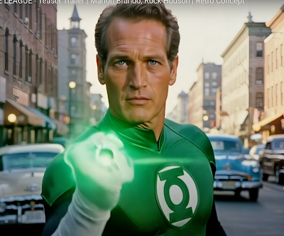
Another example: a different Youtuber easily resurrects dead movie stars such as Paul Newman, Marlon Brando or Rock Hudson and makes them actors in a new movie about the Justice League:


Paul Newman as Green Lantern

Just as inferior voices can be corrected and enhanced with AutoTune, inferior pictures can be corrected and enhanced with algorithmic technologies.  The need for skill, creativity and imagination have diminished as technology provides a colorable substitute. 

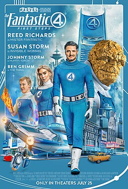
All of which brings me to the new Fantastic Four movie, scheduled to be released on July 25:


Last week I saw an advance screening of the film, which is based upon the 1968 Galactus Trilogy (in Fantastic Four #48 - 50).  Marvel Studios employed thousands of people, hundreds of millions of dollars, and the latest software to enhance and embellish Jack Kirby's 12 cent comic book.  They did everything technology could do to improve the original story.

The movie was bigger and noisier, sure, with plenty of attention-grabbing special effects, but as a work of art it couldn't compare with the power and quality of Kirby's comic book.  


Kirby's dramatic staging has been replaced by faster pacing-- about the speed you'd expect from a video game.  His costumes have been updated, for the worse.  The complexity of his content has been replaced by bland platitudes about the importance of family.  


The movie is entertaining, but with all of its advantages it feels artistically inferior to the hand drawn comic book.  So for those who say that traditional art forms can be replaced in all meaningful respects by new technologies, I say:

Not yet.